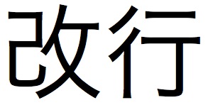
Translation isn’t only about content: often presentation is just as important. One of the most important aspects of presentation is 改行 (かいぎょう) – line breaks. There are two reasons for this.
The first is that a lot of Japanese content comes formatted with line breaks after every sentence. This formatting is especially prevalent in Powerpoint presentations.
You should always format the paragraph yourself when translating or editing a translation.
Always.
Otherwise you’ll end up with text that is shaped very strangely.
This is an exaggeration, of course.
But in Japanese, this doesn’t look as strange.
Part of it is because Japanese sentences are so long.
And the other part is that it’s much more standard to add line breaks manually in Japanese.
Check out an email from a Japanese person.
I think most Japanese people rarely make it to the end of a line without a manual line break.
Do your best to format the text into coherent paragraphs.
Often the Japanese will have an extra line break between sections, which should give you a hint at appropriate paragraphing.
The other important aspect of line breaking has less to do with presentation and more to do with programming. Because video game text has to fit on a screen, generally there is a cap on the number of characters per line: a “character limit” – 文字制限 (もじせいげん). I don’t know much about the specifics of how this works, to be honest, other than that translators and project managers have to abide by the character limits provided by game companies. Some companies have automatic solutions, but others still input the line breaks manually.
Japanese fonts are all monospaced (each character occupies a uniform amount of space), so it’s relatively easy to break the lines. English fonts are not, at least not always. Certain fonts are monospaced, the classic example being Courier. With a monospaced font, you can set a rubric for yourself at the top of a document. Say that the limit is 32 characters. Type out “abcdefghijklmnopqrstuvwxyz” – that gives you 26 characters, and you can add numbers to fill it out: abcdefghijklmnopqrstuvwxyz123456. 32 characters. In the words of Emeril, BAM. Remember that this just gives you a rough estimate. You should be counting the characters as you go. (And, no, a character limit is not a good excuse for a poor translation.)
Depending on which version of Microsoft Excel you have, you can also use macros to count the number of characters. I’m not very good with coding and the macro I was taught at work doesn’t appear to work on Open Office nor on Office Mac 2008 (my current platforms), so I won’t pass it on for fear of passing out poor info. Anyone know any cool macros to count characters?


This always mystifies me when I see it in emails – I’m constantly reassembling the lines into paragraphs!
The LEN function should do what you’re looking for (it does in NeoOffice on my Mac, anyway). Where you have a non-proportional font… well, let’s say a lot of the games producers I worked with seemed to have excellent Visual Basic skills and would hand-craft macros for Excel based on the pixel width of each character at a certain font size. The macro would then count the pixels being used on each line and warn the translator when they went over that. At which point you insert the manual line break. (And then the developer would change the font size…)
Ah, true – thanks for that. “=LEN” works, although it counts all of the characters in one cell, regardless of whether or not there are linebreaks within a cell (which is perfectly fine if each cell is one line each). I know there’s some other macro that will produce counts for each line of a cell, but apparently it doesn’t work with my current setup.
Thanks for the reminder. It’s nice to have it searchable on the blog, too. I’ll update the post at the bottom.
Crazy about the game producers! I guess I worked with some less than stellar producers in my time, heh.
http://ginstrom.com/CountAnything/
This is good stuff if you’re on a Windows machine.
Pingback: How to Japonese» Blog Archive » Updates 2010/07/08
I should point out that not all Japanese fonts are monospaced. The most obvious examples are the MS P Gothic and Mincho fonts bundled with Windows. The “P” means “proportional.” On Mac OS X, Osaka comes in “Regular” and “Regular Monospace” variants.
Your point stands, though, that Japanese text is often expected to be laid out in a grid, and many typographical conventions stem from this basic assumption.
…And then of course the same assumptions are applied without question to English text, and you get horrific interfaces in games by *ahem* certain companies…
Interesting – didn’t know that! Thanks for the comment.